
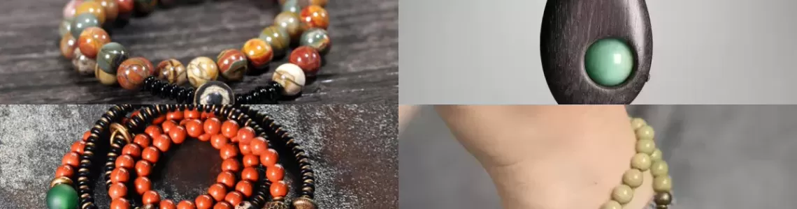
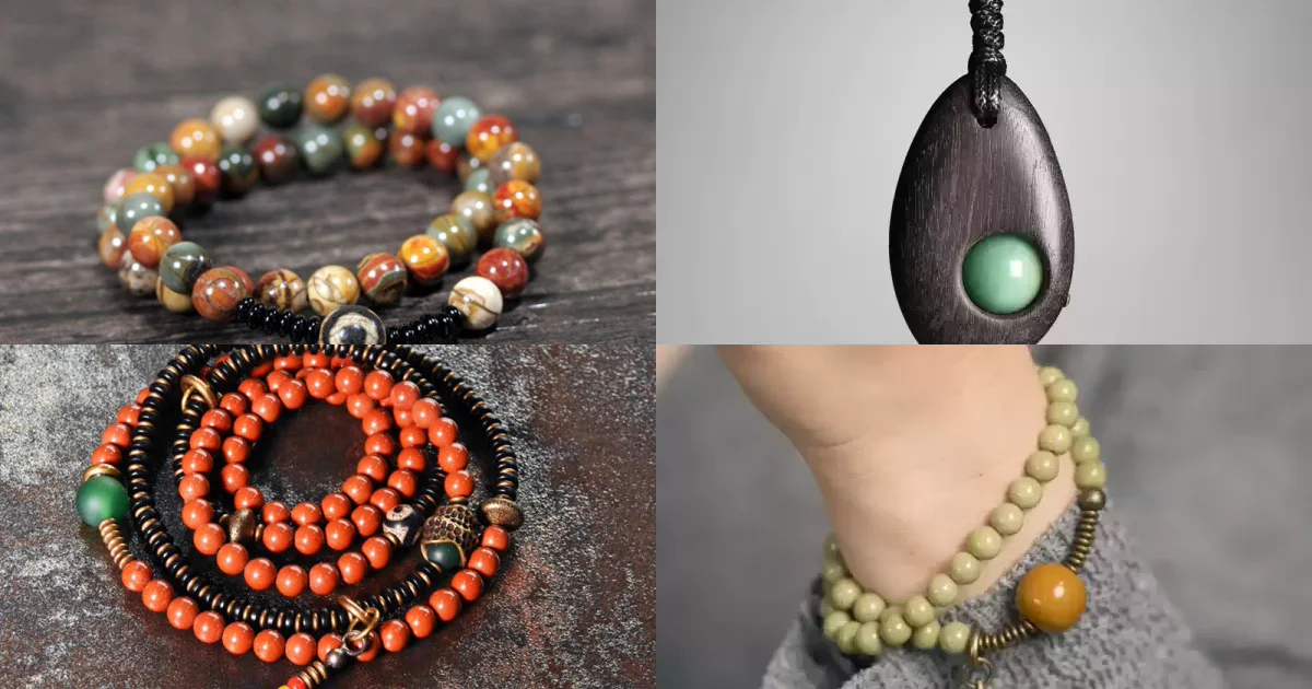
Answer first: Jewelry colors can look different online because a photograph records the interaction of the object, the light, the camera settings, the editing workflow, and the display used to view the image. That does not automatically mean the seller changed the color or that the material itself changes color. It means one image is evidence of appearance under one set of conditions, not a universal color guarantee. Compare several photos, look for a neutral reference, read the written material description, and check the return policy before treating a screen color as exact.
Research question and scope
This guide asks: Why can the same jewelry look warmer, cooler, lighter, darker, greener, redder, or less saturated on another screen, and what should a buyer do about it? It applies to beads, gemstones, wood, brass, silver, plating, enamel, and mixed-material jewelry viewed through product photographs or video. It is a practical buying guide, not a remote gem identification service, a monitor calibration certificate, or an accusation about any particular seller.
The central distinction is between appearance and identity. A photograph can show shape, arrangement, surface, and approximate color under the photographed conditions. It cannot by itself prove a mineral species, treatment, origin, metal fineness, or exact color in every room. Those claims need written specifications and, when the value justifies it, appropriate documentation or testing.
Four terms buyers should not mix together
| Term | What it means | Why it matters online |
|---|---|---|
| Illumination | The spectrum, direction, intensity, and diffusion of the light reaching the jewelry. | Daylight, warm indoor lamps, cool LEDs, and mixed lighting can produce visibly different appearances. |
| White balance | A camera or editing adjustment intended to make neutral objects appear neutral under a given light. | An incorrect or creative setting can shift the whole image warmer, cooler, greener, or more magenta. |
| Color management | The use of device profiles and defined color spaces to translate color between cameras, software, and displays. | Missing or mismatched profiles can change how numbers in an image become colors on a screen. |
| Color change | A material response in which perceived color genuinely changes under different illuminants. | It is a specific optical behavior, not a label for every photo discrepancy. |
The International Commission on Illumination (CIE) treats color measurement as a controlled relationship among a light source, an object, a standard observer, and defined viewing conditions. This is why an online listing cannot promise that one RGB image will look identical under every lamp and on every phone.
Why lighting changes what the camera records
Jewelry does not generate its own visible color. Light reaches the surface, and the material absorbs, transmits, scatters, or reflects different wavelengths. Change the lamp spectrum and the available wavelengths change. A warm household bulb may emphasize yellow and red components; a cool LED may emphasize a different balance; daylight itself varies with time, weather, location, and whether the object is near a blue sky or a warm wall.
Direction matters too. A polished bead can reflect the room, the photographer, or a nearby colored card. A translucent cabochon may look deeper when backlit and flatter under broad frontal light. Brass may appear brighter under a hard specular reflection and more muted under diffusion. Ebony can look nearly black in a low-exposure frame but reveal brown grain when a soft light reaches the surface. These are photographic conditions, not automatic evidence that the listed material changed.
The Gemological Institute of America photography guide recommends controlling color temperature, avoiding mixed lighting, diffusing light, and considering how the background affects a gem's appearance. GIA also notes that a neutral or white reference can help establish color balance. The practical buyer lesson is simple: a seller who provides several consistent views under described or neutral conditions gives you more useful evidence than one highly stylized image.
White balance, exposure, and editing are separate variables
Automatic white balance estimates which parts of a scene should be neutral. It can be confused by a frame dominated by red beads, green stone, dark wood, or a colored background. A photographer may instead use a known gray target or a fixed Kelvin setting. Neither method guarantees perfection, but a repeatable workflow reduces unexplained shifts.
Exposure changes perceived color as well. An underexposed dark stone may lose internal variation; an overexposed polished silver highlight may clip to featureless white. Raising shadows can reveal structure while also reducing contrast. Increasing saturation can make a product more vivid, while aggressive noise reduction can smooth inclusions or grain. Basic corrections are normal parts of digital photography, but they should not create a materially misleading impression.
A useful boundary comes from GIA's alexandrite origin research, which records warm- and cool-light appearances under standardized photographic conditions and explains that color evidence is only one part of a larger identification process. That research concerns a specialized color-change material, but its principle is broadly helpful: an image should communicate observed appearance under stated conditions, not pretend to replace identification or origin evidence.
Why two screens can show the same file differently
After the image is made, it still has to be interpreted by software and a display. The International Color Consortium (ICC) explains that profiles describe how an input, display, or output device represents color so values can be translated through a common color-management system. If a file is tagged, the browser honors the tag, and the display has an accurate profile, the workflow is more predictable. It is still limited by the display's gamut and the viewing environment.
The ICC's display calibration guidance distinguishes calibration from profiling and recommends an sRGB-oriented workflow for ordinary web delivery. A wide-gamut phone in vivid mode may render some colors more intensely than an older sRGB monitor. Night mode can make the screen warmer. Brightness set very high can make dark products look more open than they will indoors. Reflections from the room and the eye's adaptation to surrounding colors can also change perception.
Therefore, "it looked different on my phone" can be a real observation without proving which stage caused the difference. The photograph, embedded profile, browser, display mode, brightness, and room light are all plausible contributors. A buyer can reduce uncertainty, but cannot eliminate it with a single consumer screen.
When a material really can change appearance under different light
Some gems have documented color-change behavior. The GIA review An Update on Color in Gems explains that observed gem color depends on the illumination, the material's selective absorption, and human visual response. Alexandrite is the familiar example: a suitable specimen can show a greenish appearance in daylight-like illumination and a redder appearance under incandescent-like illumination.
But three cautions prevent overclaiming. First, the strength and direction of change vary among specimens and viewing conditions. Second, synthetic or simulated materials can also show color-change effects, so the effect alone does not establish natural origin. Third, an ordinary difference between two photos is not enough to diagnose color change. Our separate alexandrite bracelet buyer guide explains the material, synthetic disclosure, care, and evidence boundaries in more detail.
A six-step photo check before buying
- Start with the written specification. Record the stated material, metal, treatment, finish, dimensions, and any word such as natural, synthetic, imitation, dyed, plated, or color-change. A color impression cannot replace these facts.
- Compare more than one view. Look at the main image, close-ups, side views, wrist or neck views, and video if available. Consistency across views is more informative than one dramatic frame.
- Find a neutral clue. White, gray, black, skin, or a familiar metal component can reveal whether the entire scene is shifted. None is a certified target, but a strong color cast affecting every object deserves caution.
- Check highlights and shadows. Featureless white highlights or crushed black areas hide information. Ask whether important grain, inclusions, plating edges, holes, seams, or surface texture remain visible.
- Use a second display carefully. Compare a phone and a computer with night mode, vivid mode, and color filters disabled. Agreement increases confidence; disagreement identifies uncertainty, not the "true" color.
- Read the return terms. If color is essential to the purchase, confirm the inspection window, unused-condition requirements, and return process. The sunMYLOVE returns and refunds policy is the relevant place to check before ordering.
How to ask a seller for a more useful image
Ask a narrow, answerable question rather than requesting a "perfectly accurate" photo. For example: "Could you provide one unfiltered photo near neutral daylight, with a white or gray reference, and tell me whether the stone is natural, synthetic, dyed, or treated as applicable?" If the item is color-change material, ask for two images of the same piece under two named light types without changing the camera white balance between frames.
Also ask whether the photograph is of the exact item or a representative sample. This matters for materials with natural variation. An inclusion photograph can help you inspect visible structure, but it cannot remotely prove jade identity or treatment. Similarly, the Alashan agate buyer guide explains why trade labels, appearance, and mineral identification should be kept separate.
Decision table for color-sensitive purchases
| What you observe | Reasonable interpretation | Best next step |
|---|---|---|
| All objects in one photo look warm or cool | Possible lighting or white-balance shift | Compare a neutral-light image and another view. |
| Only polished highlights change dramatically | Likely reflection angle, exposure, or surrounding color | Inspect diffuse-light and side-angle views. |
| The same file differs across devices | Possible display mode, gamut, brightness, or profile difference | Disable vivid/night modes and compare in neutral room light. |
| A claimed color-change gem differs under named lamps | Could be a real optical effect, but not proof of origin | Request disclosure and documentation; assess the exact specimen. |
| Color is vivid but material/treatment is unspecified | Identity and treatment remain unknown | Buy only after the written claim is clarified. |
| Several views disagree and return terms are restrictive | High color-risk purchase | Pause or choose a better-documented item. |
Applying the method to real jewelry categories
In beaded bracelets, compare color together with bead variation, drill holes, cord, and fit. A red or green bead can dominate the screen, but construction controls daily wear. For the site's alexandrite bracelet listing, the useful questions are the exact material wording, whether the pictured piece is representative, and how the apparent color responds to named lighting.
For the green aventurine and ebony pendant, inspect the green component and the dark wood under more than one view; our green aventurine guide separates quartz identity, glass imitation, appearance, and care. For red materials, the red agate color and treatment guide explains why hue alone cannot establish whether chalcedony is untreated, heated, or dyed.
The same framework applies to pendants, where distance and scale alter the visual impression. Browse pendant necklaces by checking dimensions and materials before deciding whether a close-up color is the main purchase criterion. A macro image can make a small accent look dominant; a worn view helps restore scale.
Common mistakes
- Treating one RGB value as an objective material color. A sampled pixel belongs to a processed image under particular conditions, not to the object in every environment.
- Assuming every difference is deception. Normal capture and display variables can produce differences. Judge the full evidence and written claim.
- Assuming every difference is harmless. Extreme selective editing, hidden treatments, or inconsistent specifications can be material to a buying decision.
- Using a phone photograph to identify a gem. Color overlap among minerals, glass, synthetics, coatings, and treatments is too broad for reliable remote identification.
- Ignoring scale and finish. Enlarged close-ups, strong reflections, and shallow depth of field can change the perceived importance of color and texture.
- Skipping return terms. If an exact shade matters, a fair inspection and return pathway is part of the product evidence.
Frequently asked questions
Can a seller guarantee that jewelry will match my screen exactly?
Not realistically across uncontrolled phones, monitors, brightness settings, and room lighting. A seller can use a controlled, color-managed workflow and provide representative images, but the buyer's display and environment remain variables.
Does a white background guarantee accurate color?
No. It is a useful neutral clue and can support white-balance checks, but the background itself may be clipped, tinted, or edited. A known gray target and controlled workflow are stronger evidence.
Why does silver look gray in one image and white in another?
Polished metal mirrors its surroundings. Light size, angle, exposure, background, and surface finish can move the appearance from bright white highlights to dark gray reflections without changing the metal.
Can color prove that a stone is natural?
No. Natural, synthetic, imitation, dyed, heated, coated, and untreated materials can overlap in apparent color. Identity and treatment require appropriate evidence beyond a screen image.
Should I trust a color-change video more than photographs?
A continuous video can show how one piece responds while lighting changes, but automatic exposure and white balance can still shift the scene. Ask for the lamp types and whether camera settings remained fixed.
What display setting should I use?
For a practical comparison, disable night mode, vivid enhancement, and accessibility color filters; use moderate brightness in neutral room light; and compare a second reasonably modern display. This reduces uncertainty but is not professional calibration.
What should I do if the delivered color is different?
Compare the item in neutral daylight and ordinary indoor light, review the saved listing and written specification, avoid wear or alteration, photograph the discrepancy under a neutral reference, and contact the seller within the stated return period.
Method and evidence limits
We reviewed standards and guidance from the CIE, ICC, GIA, and the U.S. Federal Trade Commission, then translated those principles into a low-risk buying workflow. We also checked the linked sunMYLOVE categories, products, guides, and policy pages for live access and canonical consistency on 2026-09-06. Search volume for the primary phrase is UNKNOWN; no estimated volume is presented as Google Search Console fact.
This guide can explain plausible causes of a color discrepancy. It cannot determine the cause of a specific listing without the original file, capture conditions, editing history, device profiles, display state, and physical item. It also cannot authenticate a gemstone or establish treatment, origin, durability, or value from color. The FTC Jewelry Guides support truthful descriptions of jewelry characteristics, but they do not turn a consumer screen into a measurement instrument.
References and evidence scope
- CIE 015:2018, Colorimetry, 4th Edition - standard colorimetric framework, illuminants, observers, viewing conditions, and color differences.
- International Color Consortium, Getting Started with Color Management - device profiles, color-space translation, gamut, and viewing limits.
- International Color Consortium, Display Calibration - calibration, profiling, sRGB web workflow, and display consistency.
- Gemological Institute of America, Gem Photography - controlled light, diffusion, backgrounds, and color balance for gemstones.
- GIA, An Update on Color in Gems, Part 1 - interaction of illumination, material, and human vision; genuine color-change behavior.
- GIA, Geographic Origin Determination of Alexandrite - standardized warm- and cool-light photography within a multi-method identification and origin workflow.
- U.S. Federal Trade Commission, Guides for the Jewelry, Precious Metals, and Pewter Industries - boundaries for material representations in jewelry marketing.
Reviewed: 2026-09-06.
sunMYLOVE editorial note: This article distinguishes measured color principles, institutional guidance, practical inference, and unresolved uncertainty. It does not claim that any photographed product is laboratory identified, that color is identical on all displays, or that a specific seller intentionally changed an image.
Leave a Comment